Nokia redesigns logo in 60 years, focusing aggressive growth
text_fieldsReuters photo.
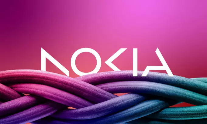
Barcelona: Nokia, the Finland-based multinational telecom equipment giant, announced on Sunday its plans to change its logo for the first time in 60 years, Reuters reported.
The new logo will feature five different shapes to form the word Nokia. The iconic blue colour will be replaced with a range of colours depending on the use, Reuters writes.
Company's Chief Executive Pekka Lundmark told Reuters in an interview that the company had an association with smartphones, but these days Nokia is a business technology company.
"There was the association to smartphones, and nowadays, we are a business technology company," Lundmark said.
The annual Mobile World Congress (MWC) is all set to begin on Monday in Barcelona, and Nokia will be making an update there. The event will last till March 2.
The company was struggling before Lundmark took over in 2020. He rolled out a strategy with three stages, namely reset, accelerate and scale. Lundmark said that the reset stage is complete, and Nokia is about to begin the acceleration stage.
Nokia is focussing on selling gear to other businesses though it still aims to grow its service provider business. The company sells equipment to telecom companies with the latter.
Lundmark said that Nokia had a 21 per cent growth last year in enterprise, which is an 8 per cent of its sales or "2 billion euros ($2.11 billion) roughly. We want to take that to double digits as quickly as possible," Reuters quoted Lundmark.
He added that India is their fastest-growing market with lower margins.


